


Q 01Can you explain why you set up deValence and say something
about the context in which it was established?
Why deValence?

When we set up deValence twenty years ago, we were fortunate enough to find a place among the independent designers working in Paris. We came from the city of Valence (south of Lyon, in eastern France) where we had studied for two years and we named our studio after it. We believed it was important to stress the fact that we did not come from the capital and that, for someone wanting to set up a business in this field, it is not obligatory to have trained in Paris. We found there was room for the approach we wanted to develop in graphic design. We wanted to concentrate on text and its relationship to images, taking a pragmatic and concise point of view. Our principles included “no ornamentation, no text on images, no stylistic self-indulgence” and, more generally “no symbolism”.
We felt it was essential to be seen as designers rather than artists. With this in mind, we set out to produce a stripped-down design influenced by Swiss and Dutch designers. Structure was placed before the finished image. For us, the most important thing was the way the message is transmitted to the viewer or reader.
From the outset, one of our principles was that text should never be placed on an image. Our belief was that, in a page layout, images should have an equal status with text. Typography is a tool that can highlight the force of a message or, alternatively, the insignificance of an intention. We create systems that depend on both typography and the available space on a page or screen. That’s the basis of our work.
Q 02Can you explain why you work as a “design unit”?
How are the different roles and projects allocated?
The first thing to say is that for all of us it’s impossible to work on our own. During our training we very quickly began to work in groups and found we enjoyed it. It could just as well have been as a group of musicians because we often got together to play music or spend time with friends like the artist Raphaël Zarka. We have always exchanged ideas, tested out hypotheses and shared our work so as to arrive together at the realization of a project through the construction of form. Our studio bases itself on this principle. Today, thanks to the experience acquired over the last decade, we are in a position to take on bigger commissions. We deal with all kinds of subjects and materials, calling on various different skills depending on the project (design of typefaces, animation, etc.).

Q 03Can you tell us something
about your approach to the creation of visual systems?
The arrangement of images and words in a two-dimensional space is not an end in itself. That is not design. The work of the designer in arranging different forms is always done with a view to what will happen in the future. For example, the simple act of placing a page number on a page of a book is not just a matter of positioning it there but also asking whether the number placed in this way will work for all the other pages of the book.
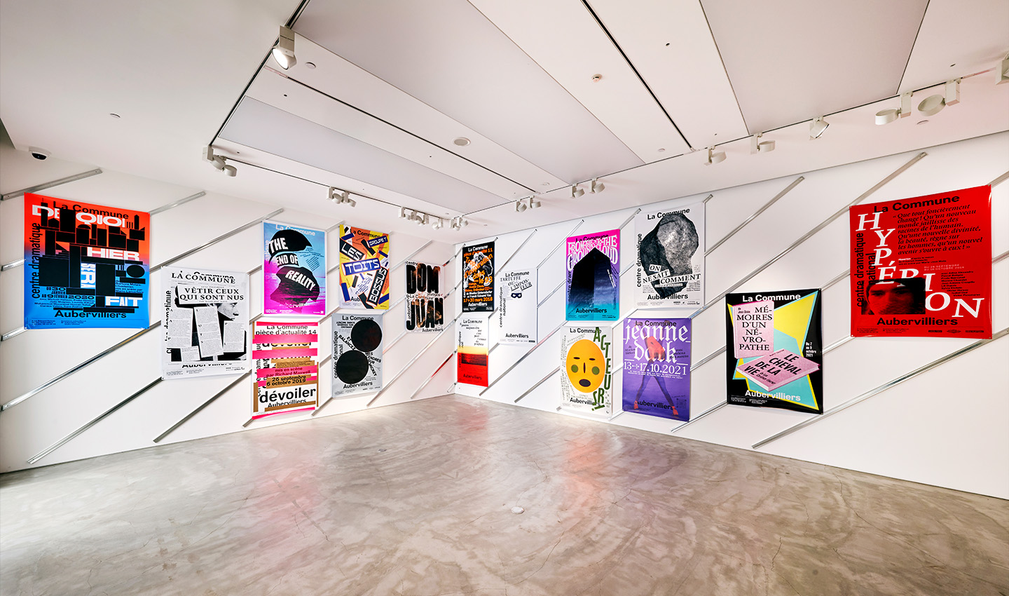
Or, in the case of a visual identity, we check and try out the forms we have designed in a whole group of other situations. A form does not exist in isolation. It always resonates with other forms of different types. To give you a more specific example, the visual identity we designed for the La Commune Theater in 2014 is based on a simple system. Firstly, the language, which is to say the name of the theater presented in a simple linear font. The characters are very plain and do not distract from the name of the theatre which refers to the Paris Commune of 1871. The text used on the brochure is set in a classic font. The only images are those provided by a photographer we commissioned to document the theater’s context. The only place where our design subjectivity comes into play is in the design of posters for the events at the theater. Just as a director puts and arranges actors on stage, so we use the space on the poster to create a visual announcement for the play. All these elements, appearing to the spectators at different times, constitute our system.
Q 04The typefaces you design have very assertive, beautiful forms,
and at the same time we see that they have a great capacity for movement - they are dynamic.
Can you explain how you approach the creation of a typeface, and the management of typography more generally?
It is important to be clear that we are not exclusively designers of typefaces. Those that we have designed were produced for very specific occasions. The characters are either contextual (specific to a particular visual identity or signage project, for example), or their design is created to respond to a particular need or working tool. Dada Grotesk (designed with Gaël Etienne in 2005) was created for the catalogue we produced for the Dada exhibition at the Centre Pompidou. Plus, in its various versions, is a condensed and very bold titling character that we needed for our work. And then there are others like that designed (by Alex Chavot) for the Maison de la Vache qui rit, taking its inspiration from the brand’s cheese boxes of the 1920s.
We see typography as a material – something we can model and arrange as we wish. Drawing and manipulating letter design is something we have always enjoyed in our work. But at the same time the typefaces we use for a book or internet site are always very clear and legible. The typography accompanies the reader towards the information, the content that is given as knowledge. We also like to play with typographical conventions, uses and habits. While we are scrupulously careful to respect the rules of text composition, we enjoy questioning the way in which certain structural elements appear, follow on from one another, give rhythm to a book or play with the visible space.


Q 05How do you see the role of deValence in society?
And could you explain why you decided to set up the B42 publishing house?

It is never easy to answer a question about the role of the graphic designer in society, particularly in France where the very essence of our work – in other words what seems necessary to us designers – is not part of the collective imagination. The situation is very different in Japan where design is an integral part of society and where the humblest packaging is carefully thought out by a designer.
Our role, that of the graphic designer, is an essential one even if it might seem unimportant and is often poorly understood. In France we are often at variance with clients who are not aware of the range of creative and original ideas at our disposal and our ability to analyze situations, ask questions and suggest answers. Our role is like a filter through which information is transformed, resulting in better transmission and better understanding by the user, the spectator or the reader.
We have often spoken about the need for the designer to “disappear”, but this position – although fundamental to our work – is perhaps sometimes misunderstood. The designer undertakes a project, develops it according to their own convictions; it is in the careful arrangement of elements that forms emerge. Our job is to manipulate forms. And this activity, this way of seeing the world through forms is today a genuinely political act. This is our role: to shape forms and disappear.
We established the B42 publishing house out of necessity and to respond to a real lack of resources in the fields that interest us including design and typography. We have translated a considerable number of essential texts in these areas, making them available for French speakers. No other publishing company had done this kind of thing before. During our studies, we found that many of the resources needed to help understand how the history of graphic design and typography could feed into our work were lacking. Through B42 we are also able to set up projects dealing with many of the questions that arise daily in our field of activity.
In existence now for thirteen years, B42 has developed into a professional publishing concern surpassing our wildest dreams. We have an on-going publication program and are exploring ever-new areas of thought. The publication program develops in line with our personal areas of interest.
The public will notice differences not only in the appearance of our books but also in the way the catalogue is constructed. B42 is headed by a designer and that is evident from the choices and juxtaposition of certain themes and authors. John Berger, for example, rubs shoulders with Bunpei Yorifuji. We see a clear connection between them in the questions their works raise about the notion of le regard (“the gaze”). Other examples have ideas about typography standing alongside anthropology. That might seem confusing at first. The confrontations we set up help us to break through the limits of our discipline and offer ways of seeing society through design and considering the world through form.
B42 came about because of a lack and for us, as time has progressed, publishing has become a necessity.
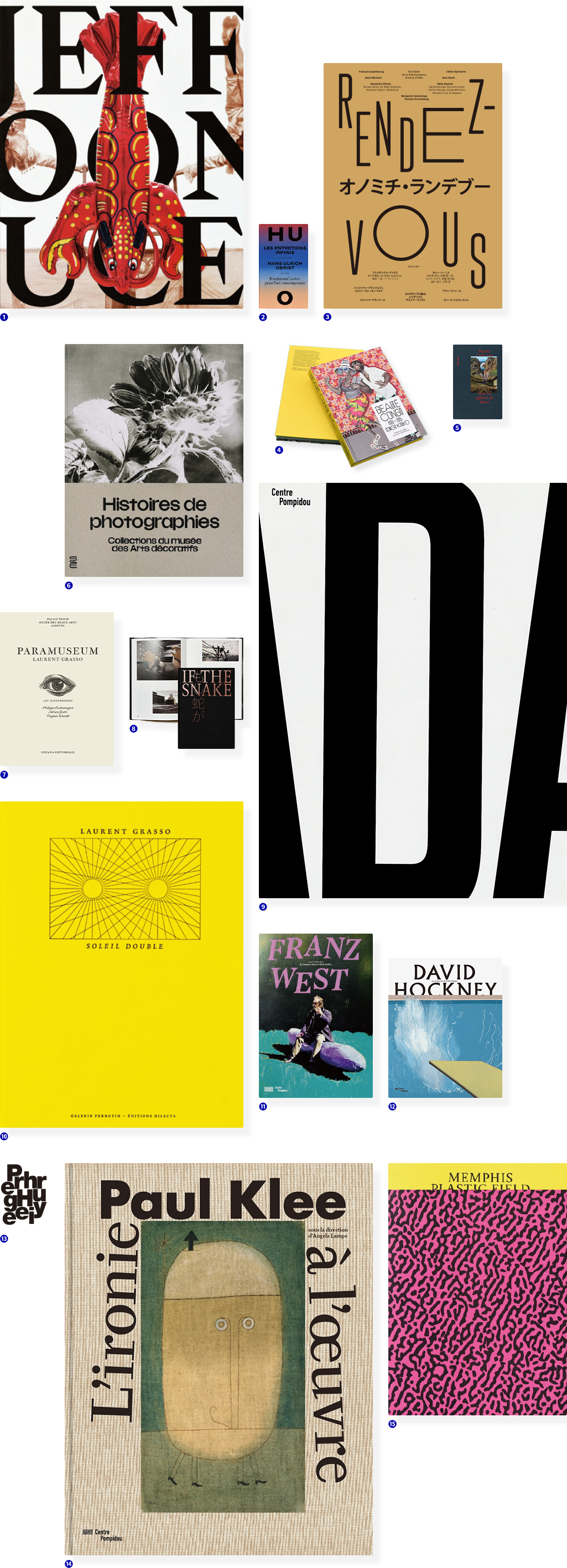
- ❶Jeff Koons Mucem. OEuvres de la Collection Pinault-
21 x 27 cm - ❷Hans Ulrich Obrist,
The Infinite Conversations Fondation Cartier
14,2 x 22,6 cm - ❸Rendez-vous, Villa Kujoyama,
22 x 30 cm - ❹Beauté Congo, Fondation Cartier,
20,7 x 28 cm
- ❺Pierre Ardouvin, Tout est affaire de Décor MAC/VAL
11 x 16,5 cm - ❻Histoires de photographies Musée des Arts Décoratifs
24 x 29 cm - ❼Laurent Grasso,P aramuseum, Silvana Editoriale,
20 x 27 cm - ❽If the Snake - Okayama Art
Summit
- ❾Dada, Centre Pompidou
21,3 x 28,3 cm - ❿Laurent Grasso,
Soleil Double Editions Dilecta / Galerie Perrotin,
22 x 29,5 cm - ⓫Franz West, Centre Pompidou,
20 x 29 cm - ⓬David Hockney Centre Pompidou
24,5 x 29 cm
- ⓭Pierre Huyghe, Centre Pompidou,
20,7 x 28 cm
English version - ⓮Paul Klee, Centre Pompidou
23,5 x 30 cm,
French version - ⓯Memphis Plastic Field MADD Bordeaux
22,5 x 30 cm
- ❶Jeff Koons Mucem. OEuvres de la Collection Pinault-
21 x 27 cm - ❷Hans Ulrich Obrist,
The Infinite Conversations Fondation Cartier
14,2 x 22,6 cm - ❸Rendez-vous, Villa Kujoyama,
22 x 30 cm - ❹Histoires de photographies Musée des Arts Décoratifs
24 x 29 cm
- ❺Pierre Ardouvin, Tout est affaire de Décor MAC/VAL
11 x 16,5 cm - ❻Laurent Grasso,P aramuseum, Silvana Editoriale,
20 x 27 cm - ❼Beauté Congo, Fondation Cartier,
20,7 x 28 cm - ❽If the Snake - Okayama Art
Summit
- ❾Franz West, Centre Pompidou,
20 x 29 cm - ❿Pierre Huyghe, Centre Pompidou,
20,7 x 28 cm
English version - ⓫Dada, Centre Pompidou
21,3 x 28,3 cm - ⓬Memphis Plastic Field MADD Bordeaux
22,5 x 30 cm
- ⓭David Hockney Centre Pompidou
24,5 x 29 cm - ⓮Laurent Grasso,
Soleil Double Editions Dilecta / Galerie Perrotin,
22 x 29,5 cm - ⓯Paul Klee, Centre Pompidou
23,5 x 30 cm,
French version
Q 06Could you say something about the links you have established over time with Japan?
In what way has Japan inspired your work?
Like many Westerners discovering the country and its landscapes and culture, we were intrigued by Japan. A single trip to Japan as a tourist only shows you the surface, but even our early encounters with the country, its culture and its social organization raised many questions, questions for which we felt we needed to find answers. And to find them, we needed to return to Japan.
In 2012, Alexandre had a four-month residency at the Villa Kujoyama in Kyoto during which time he began an exploration of contemporary Japanese graphic design. Most importantly, his stay there enabled him to meet Japanese designers and establish lasting relationships with a number of them. Although the lack of a common language can sometimes be frustrating, it has not inhibited a fruitful dialogue and exchange of ideas.
It is not so much Japan that has inspired us as the relationship and exchanges with the designers we met there. This was similarly? the case with the European designers we invited to speak when we organized conferences in Paris. And the same is true when, in preparation for a book, we meet the authors.
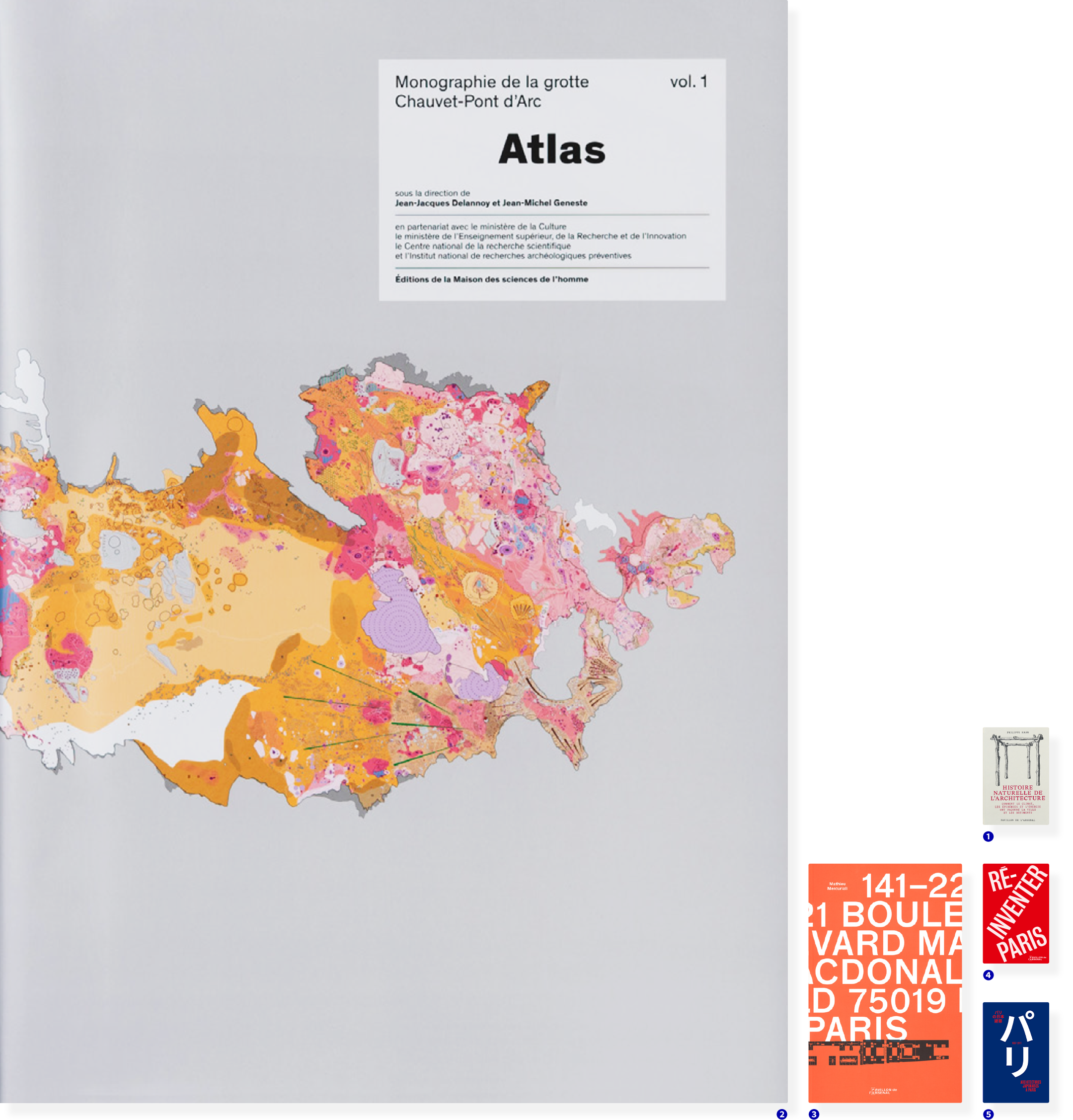
- ❶Histoire naturelle de l’architecture, Pavillon de l’Arsenal,
14,5 x 22 cm - ❷Atlas de la Grotte Chauvet Pont d’Arc,
Fondation Maison des Sciences de l’Homme
34 x 48 cm
- ❸141-221 Boulevard MacDonald 75019 Paris,
Pavillon de l’Arsenal,
19 x 27 cm
- ❹Réinventer Paris, Pavillon de
l’Arsenal, 13 x 19,5 cm
- ❺Architectectures japonaises à Paris, Pavillon de l’Arsenal
13 x 19,5 cm
- ❶Atlas de la Grotte Chauvet Pont d’Arc,
Fondation Maison des Sciences de l’Homme
34 x 48 cm - ❷Histoire naturelle de l’architecture, Pavillon de l’Arsenal,
14,5 x 22 cm
- ❸Réinventer Paris, Pavillon de
l’Arsenal, 13 x 19,5 cm
- ❹141-221 Boulevard MacDonald 75019 Paris,
Pavillon de l’Arsenal,
19 x 27 cm
- ❺Architectectures japonaises à Paris, Pavillon de l’Arsenal
13 x 19,5 cm
Q 07Could you tell us
about your collaboration
with Bunpei Yorifuji ?
We met Bunpei Yorifuji in 2012 when Alexandre was staying at the Villa Kujoyama and preparing for the publication of an issue of the review Back Cover dedicated to Japanese graphic design. First and foremost, he was one of the first people agreeing to meet me although I did not know him at the time and he was not introduced by a third person. He was extremely generous, sharing his work and his ideas. One of the key things we both agreed on was the question of transmission. For Alexandre, it was both as a writer, through his books, and as a designer carrying out commissions. For us, it was as publishers and also in our approach to design. We almost instantly wanted to translate his books into French. He was fascinated by his ability to synthesize and his generosity. It took time, however, to draw up the agreements and contracts with the literary agent. The first book we published was “Rakugaki master” in 2016. Since then we have published a total of six of his works. An important moment was when he came to Paris in 2018 for the Laterna Magica festival at the Centre Pompidou. He had a chance to meet his French readers, give workshops and talks and we spent many happy hours together. He was also able to meet and establish links with designer friends of ours, including Fanette Mellier and Helmo. Since then, we meet up every time we go to Tokyo.
Q 08In a complex period with
multiple realities, what kind of
design do you think best reflects
the spirit of the age?
Given that we seem to have left modernity and that the universalist project as it was envisaged during the decades after the Second World War is obsolete, this is not an easy question to answer. The only question that can be considered in a global way is that of ecology. What is "the spirit of the age" anyway? We have no answer to this question.
As a designer,
how would you define
"I" and "subject"?
The work of the designer is a permanent dialogue between subject and form. The form (typographical, drawn, photographic, etc.) is influenced by what we are. Returning to the idea of “disappearing”, we approach the subject in the consciousness of our being. Sometimes, however, we need to take a step back, placing a distance between us and the subject to be dealt with. The right answer will emerge if we step back the right amount.

- ❶Essays series, B42, 13 x 20,8 cm
- ❷Culture series, 14 x 22 cm
- ❸Art series, 15 x 22 cm
- ❹Back Cover magazine, 15 x 22 cm
Q 09,10How do you see continuity
between the past and the future?
This is obviously an essential question for our times, particularly since the Covid-19 pandemic. During lockdown, our lives were put on hold. It was in effect an imposed and abrupt cessation of the life we had spent years building. And it was precisely at this period that the question of continuity became important. It has been a time that presented an opportunity to reflect on our work and one that forced us to concentrate on those things that matters most. It has not always been easy. But this interruption to our lives have shown us something that we already suspected: the present and the future can only be built on a knowledge and an understanding of the past. No event exists on its own. So we always try to apply a critical eye when conveying our point of view through the forms we produce and the way we implement them. This is exactly what we have been aiming at for twenty years now with our graphic design and publishing house.
How do you see
your work developing in the future?
Our work is a continuity but like any human activity it will inevitably change as we become ever more fully aware of the consequences of our actions. In other words, as for any kind of creative activity involving a form of industrial production, we need to change our methods so as to limit our impact on the environment. Not limiting ourselves to ecology, we understand environment in the full sense of the word – our living space.
Many subjects relating to society feature in B42’s publications and naturally we hope to continue with our contributions to the debate and proposals for directions to take.
As designers we will continue, above all, to consider the public with consideration, seeking to produce visual objects that provoke questions and offer ideas. But we are not naïve. We know that design and publishing are intimately linked with the market economy of which we are part. We should not, however, lose sight of our role within the system. We must always endeavor to take a critical approach in the creation of objects, and never tell people what to think.
Translation:Caroline Higgitt
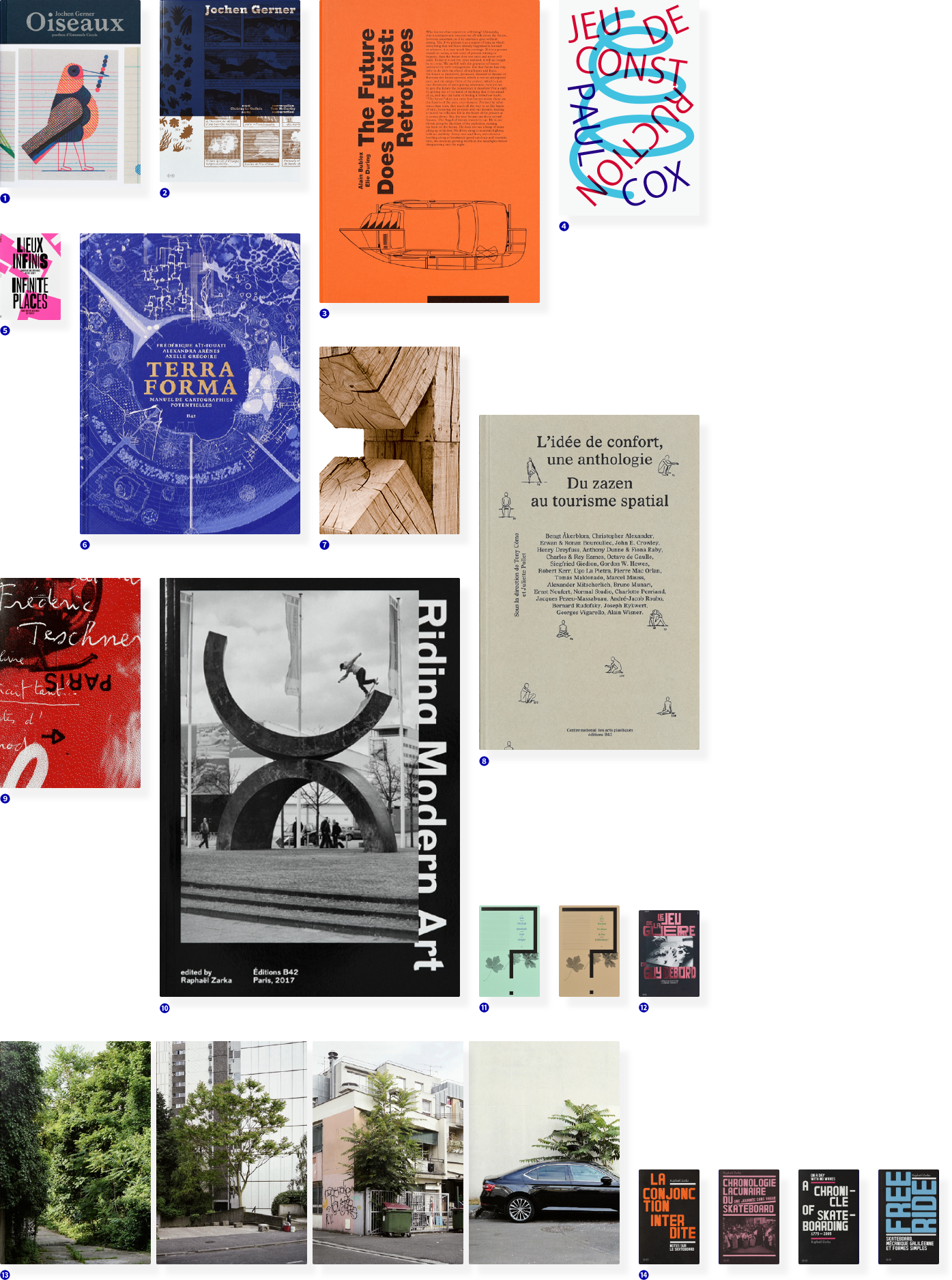
- ❶Jochen Gerner Oiseaux
16 x 21 cm - ❷Jochen Gerner
13 x 20,8 cm - ❸The Future Does not exist: Retrotypes
20 x 28 cm - ❹Paul Cox Jeu de construction
15,6 x 24 cm
- ❺Lieux Infinis / Infinite Places, edition B42,
16 x 23 cm (3 - ❻Terra Forma
19 x 26,9 cm - ❼Raphaël Zarka
19,5 x 26 cm - ❽L’Idée de confort, une anthologie
15,6 x 24 cm
- ❾Frédéric Teschner
13 x 20,8 cm - ❿Raphaël Zarka Riding Modern Art
21,5 x 30 cm - ⓫Jost Hochuli Systematic Book Design?
20 x 30 cm
(versions FR et EN) - ⓬Emmanuel Guy, Le Jeu de la guerre de Guy Debord
20 x 30 cm
(FR and EN versions)
- ⓭Simon Boudvin, Une monographie située de l’ailante,
16 x 24 cm
(several covers) - ⓮Raphaël Zarka books
13 x 20,8 cm
- ❶Lieux Infinis / Infinite Places, edition B42,
16 x 23 cm (3 - ❷Jochen Gerner Oiseaux
16 x 21 cm - ❸Jochen Gerner
13 x 20,8 cm - ❹Emmanuel Guy, Le Jeu de la guerre de Guy Debord
20 x 30 cm
(FR and EN versions)
- ❺Jost Hochuli Systematic Book Design?
20 x 30 cm
(versions FR et EN) - ❻Raphaël Zarka
19,5 x 26 cm - ❼The Future Does not exist: Retrotypes
20 x 28 cm - ❽Terra Forma
19 x 26,9 cm
- ❾L’Idée de confort, une anthologie
15,6 x 24 cm - ❿Paul Cox Jeu de construction
15,6 x 24 cm - ⓫Raphaël Zarka Riding Modern Art
21,5 x 30 cm - ⓬Frédéric Teschner
13 x 20,8 cm
- ⓭Raphaël Zarka books
13 x 20,8 cm - ⓮Simon Boudvin, Une monographie située de l’ailante,
16 x 24 cm
(several covers)

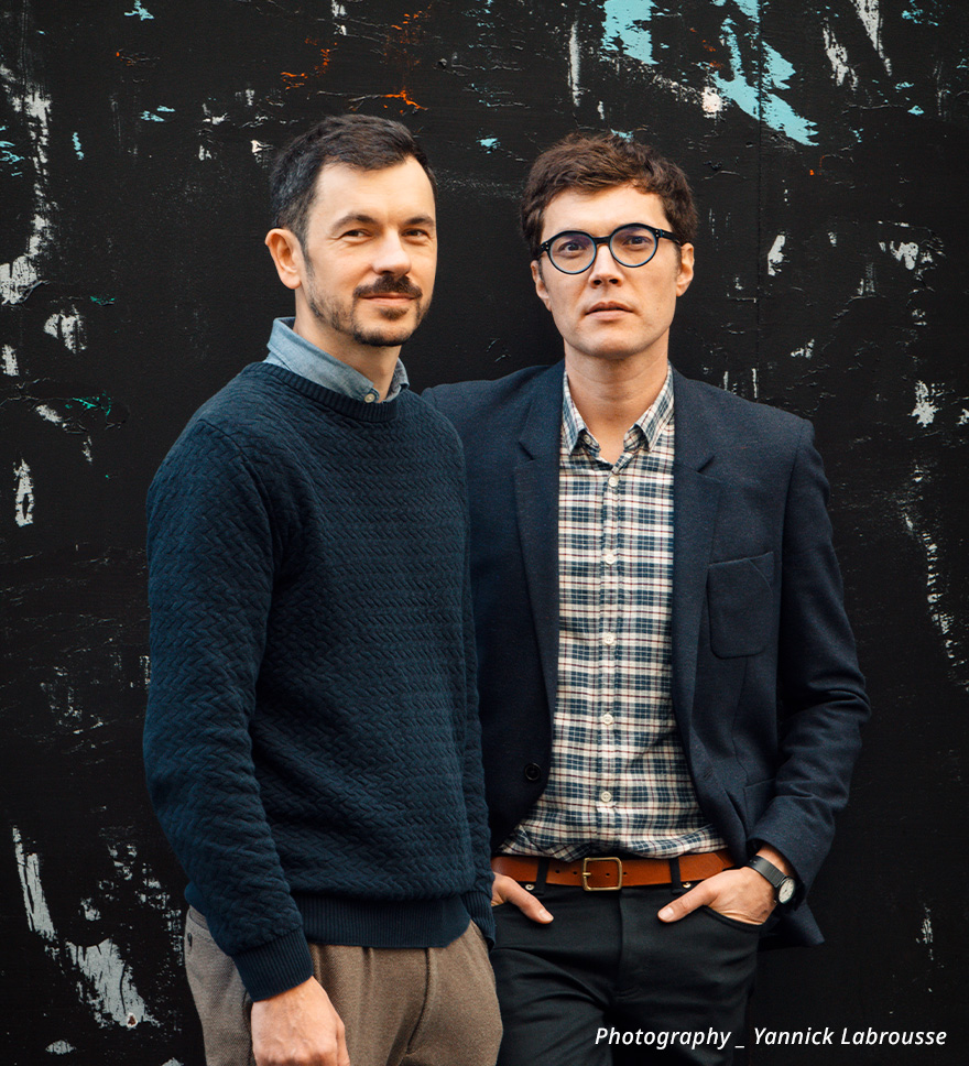

Established in Paris in 2001 deValence is headed by Alexandre Dimos and Ghislain Triboulet The studio now operates mainly in the fields of contemporary creative arts, design, theatre, publishing and architecture In parallel with its design work, deValence has always been involved in projects to promote thought on graphic design, particularly through the organization of conferences This led to Alexandre Dimos creation in 2008 of the B42 publishing house, a venture providing the essential complement to deValence specializing in the fields of design, typography, architecture and social
sciences Works published by B42 include books by Jost Hochuli, Bunpei Yorifuji Robin Kinross and John Berger, as well as the magazine Back Cover Ever since his residency at Villa Kujoyama in 2012 Alexandre Dimos has maintained strong links with Japan and publishes articles and translations on
Japanese graphic design He is a member of the AGI.
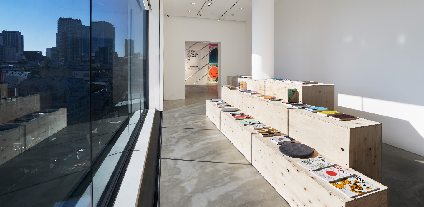
Works produced by the studio are held in Japan in the collections of the DNP Foundation for Cutural Promotion and in France in the collections of the Centre national des arts plastiques Cnap the Musée des arts décoratifs the Bibliothèque nationale de France, le Frac des Pays de la Loire (Regional Contemporary Art Collections), and le Signe, centre national du graphisme ( In 2019 deValence was awarded the Grand Prix of the Biennale internationale de design graphique de Chaumont and was invited by the DNP Foundation for Cultural Promotion for a monographic exhibition at kyoto ddd gallery.

deValence–Common Sense in Design
- Organizer :
- GYRE
- Dates :
- December 10, 2021–February 13, 2022
- Venue :
- GYRE GALLERY|GYRE 3F, 5-10–1 Jingumae, Shibuya-ku, Tokyo.
- Contact :
- 03-3498-6990
- Holiday closure :
- December 31, 2021 and January 1, 2022. Reopens at 1:00pm on January 2, 2022
- Curator :
- Takayo Iida (Director of the Sgùrr Dearg Institute for Sociology of the Arts)
- Venue Design :
- Ryuya Umezawa (ALA Inc.)
- Design(Graphic) :
- Nanami Norita
- PR :
- HiRAO INC
- Design collaboration :
- COVA (Taketo Kobayashi and Hikaru Takata and Haruka Ohta)
- Pront collaboration :
- Kawalabo!
- Photography collaboration :
- Mori Koda
- Support :
- Institut français, Fondation Franco-Japonaise Sasakawa
- Patrons :
- Ambassade de France/Institut français du Japon